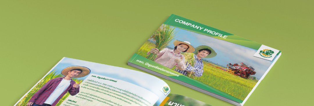
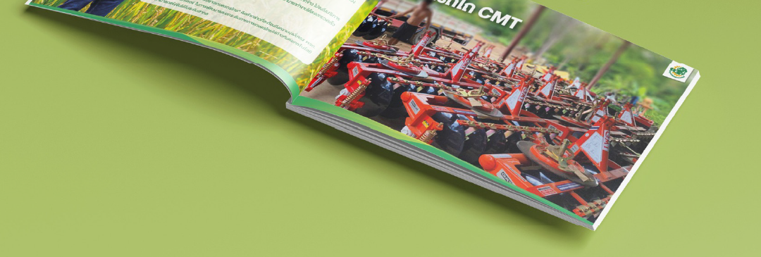
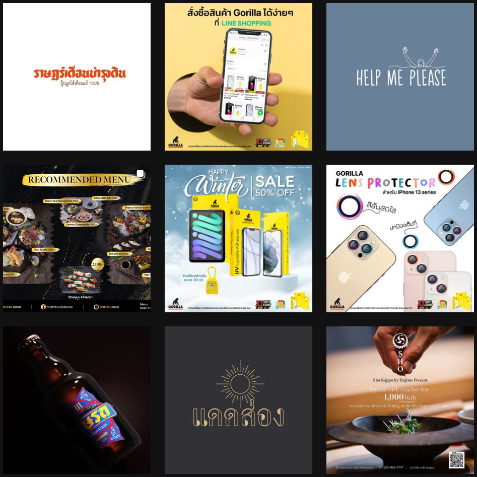
Company Profile บริษัทผู้เชี่ยวชาญด้าน รถไถและผานรถไถ ที่พร้อมเป็นคู่คิดให้เกษตรกรไทย เราออกแบบ Company Profile ด้วยโทนสีเขียวและภาพบรรยากาศท้องนา เพื่อสะท้อนความผูกพันกับเกษตรกรและสิ่งแวดล้อม ผสานกับภาพเครื่องจักรจริงที่บ่งบอกถึงความทันสมัยและความพร้อมในการให้บริการ เลย์เอาต์รูปเล่มแนวนอนทันสมัย อ่านง่าย เน้นภาพขนาดใหญ่และข้อความสั้นกระชับ เพื่อให้เข้าถึงได้ทันที ถ่ายทอดอัตลักษณ์ของบริษัทในฐานะ ผู้นำด้านเครื่องจักรกลการเกษตร ที่ทั้งมั่นคง น่าเชื่อถือ และจริงใจ
Company Profile บริษัทผู้เชี่ยวชาญด้าน รถไถและผานรถไถ ที่พร้อมเป็นคู่คิดให้เกษตรกรไทย เราออกแบบ Company Profile ด้วยโทนสีเขียวและภาพบรรยากาศท้องนา เพื่อสะท้อนความผูกพันกับเกษตรกรและสิ่งแวดล้อม ผสานกับภาพเครื่องจักรจริงที่บ่งบอกถึงความทันสมัยและความพร้อมในการให้บริการ เลย์เอาต์รูปเล่มแนวนอนทันสมัย อ่านง่าย เน้นภาพขนาดใหญ่และข้อความสั้นกระชับ เพื่อให้เข้าถึงได้ทันที ถ่ายทอดอัตลักษณ์ของบริษัทในฐานะ ผู้นำด้านเครื่องจักรกลการเกษตร ที่ทั้งมั่นคง น่าเชื่อถือ และจริงใจ
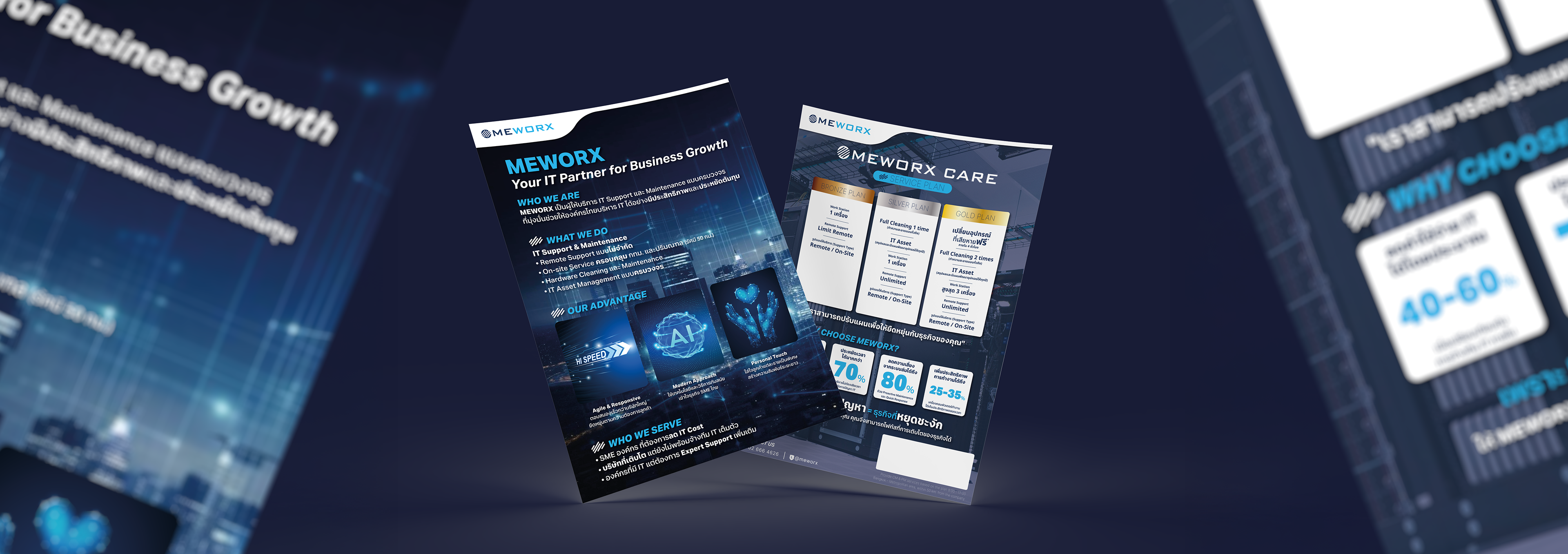
MEWORX Sales Sheet Design การออกแบบเซลชีทของ MEWORX ใช้โทนสีน้ำเงิน–ฟ้า สื่อถึงเทคโนโลยี ความเชื่อมั่น และความเป็นมืออาชีพ พร้อมภาพกราฟิกที่สะท้อนโลกดิจิทัลและ Data Center เนื้อหาถูกจัดวางอย่างมีลำดับชัดเจน ตั้งแต่แพ็กเกจบริการ Bronze / Silver / Gold ไปจนถึงจุดแข็งของบริษัท ทั้งความเร็วในการดูแล การใช้เทคโนโลยีทันสมัย และการใส่ใจลูกค้าเป็นพิเศษ ทั้งหมดนี้ทำให้เซลชีทไม่เพียงแค่ให้ข้อมูล แต่ยังช่วยตอกย้ำภาพลักษณ์ MEWORX ในฐานะ “Your IT Partner for Business Growth” ได้อย่างมั่นใจและทรงพลัง
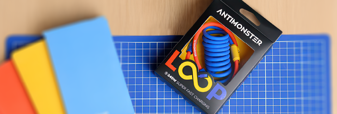
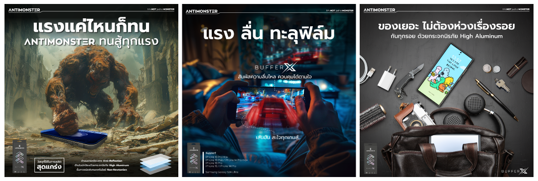
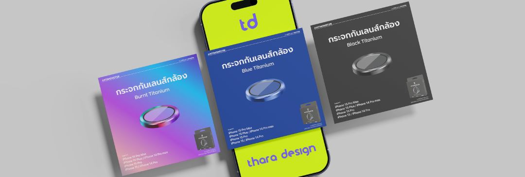
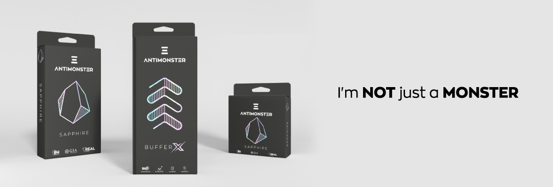
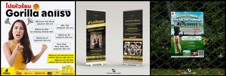
Loop Packaging Design การออกแบบกล่อง Loop ถูกสร้างขึ้นจากแรงบันดาลใจในโลกของเกม ที่เต็มไปด้วยสีสัน ความสนุก และความเคลื่อนไหว เรานำพลังงานเหล่านี้มาใส่ในโทน แดง–น้ำเงิน–เหลือง ที่โดดเด่นบนพื้นดำ อันเป็นเอกลักษณ์ของ Antimonster ทำให้ตัวแพ็กเกจจิ้งดูสนุก น่าดึงดูด แต่ยังคงภาพลักษณ์ที่พรีเมียมและเข้มแข็ง สัญลักษณ์ “∞” ในคำว่า LOOP ไม่เพียงแค่สื่อถึงความต่อเนื่อง แต่ยังสะท้อนถึงความเร็วแรงและทนทานของสายชาร์จ ที่พร้อมใช้งานได้ซ้ำแล้วซ้ำเล่าโดยไม่สะดุด ผลลัพธ์คือบรรจุภัณฑ์ที่ผสมผสาน ความสนุกแบบเกม เข้ากับ ความจริงจังของเทคโนโลยี ได้อย่างลงตัว
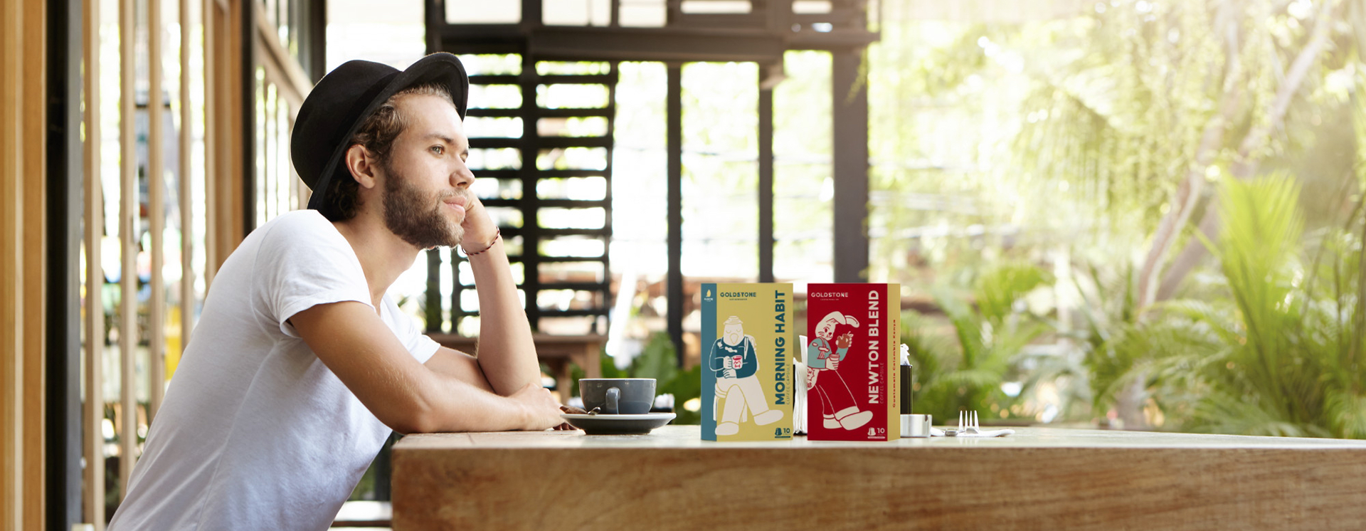
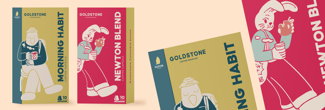
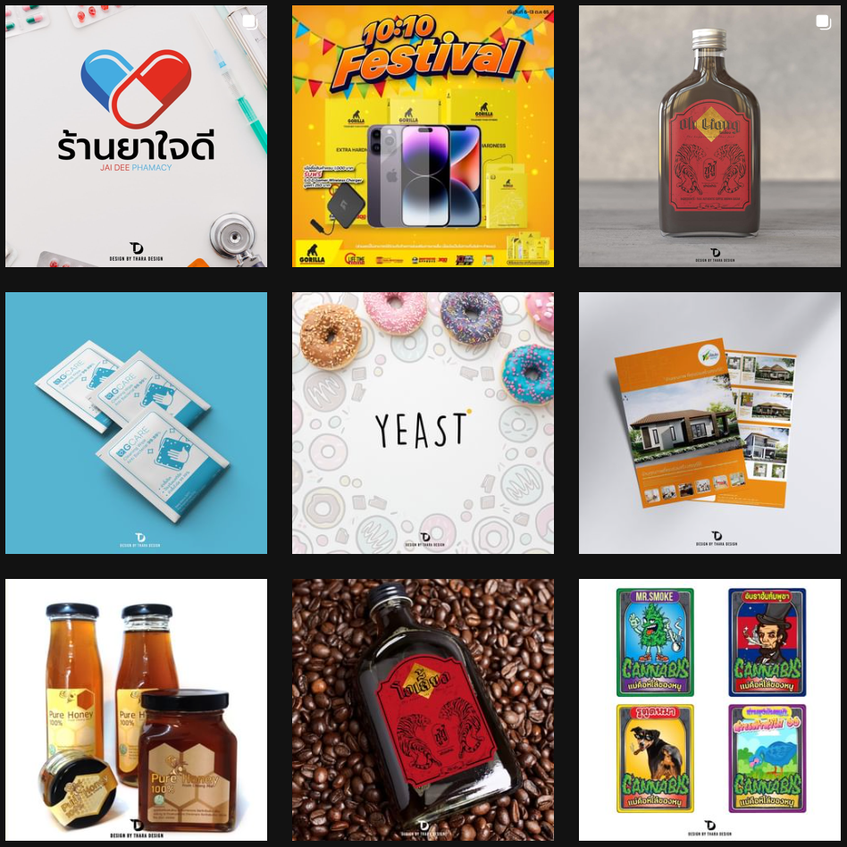
งานออกแบบแพ็คเกจแคปซูลกาแฟจากแบรนด์ GOLDSTONE ที่หยิบความมินิมอลมาผสมความมีชีวิตชีวาได้ลงตัว คาแรคเตอร์แต่ละตัวบอกเล่ารสชาติผ่านภาพลักษณ์แบบน่ารักแต่ไม่เด็ก—สไตล์ GOLDSTONE เค้าแหละ! ☕ “Morning Habit” – กล่องโทนเหลืองทอง-น้ำเงิน ให้ฟีลอบอุ่นเหมือนแดดเช้า ตัวละครเป็นนกหนุ่มสุดชิลในชุดไหมพรม นั่งจิบกาแฟแบบไม่รีบ ชวนให้เช้าไหน ๆ ก็ใจเย็นได้ 🐰 “Newton Blend” – กล่องสีแดงสดโดดเด่น คาแรคเตอร์กระต่ายสายชิล มือหนึ่งถือกาแฟ มือหนึ่งถือแอปเปิ้ล เดินทอดน่องแบบไม่แคร์แรงโน้มถ่วง รสชาตินี้เข้มแต่คูล มีพลังแต่ไม่วู่วาม—คาเฟอีนสายเนิบของจริง แพ็คเกจทั้งสองออกแบบด้วยเส้นสายที่เรียบง่ายแต่มีจังหวะ สีสันชัดเจน อ่านง่าย และที่สำคัญ…น่าหยิบแบบไม่ต้องคิดนาน!
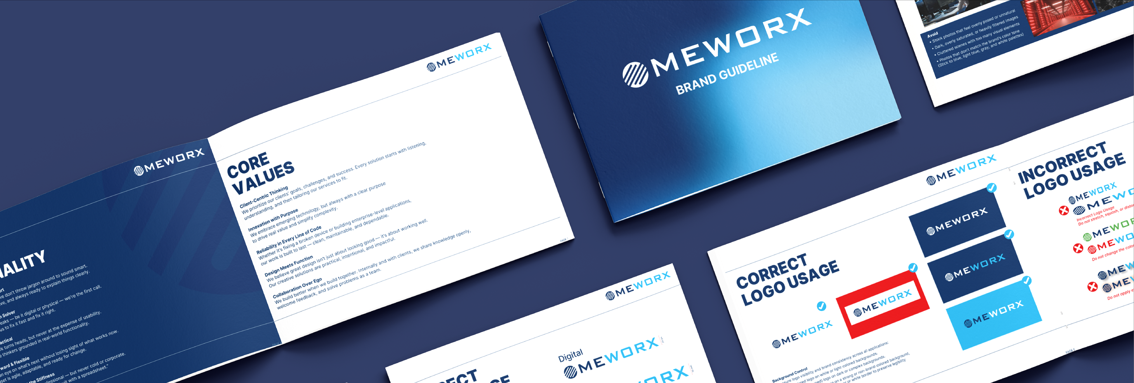
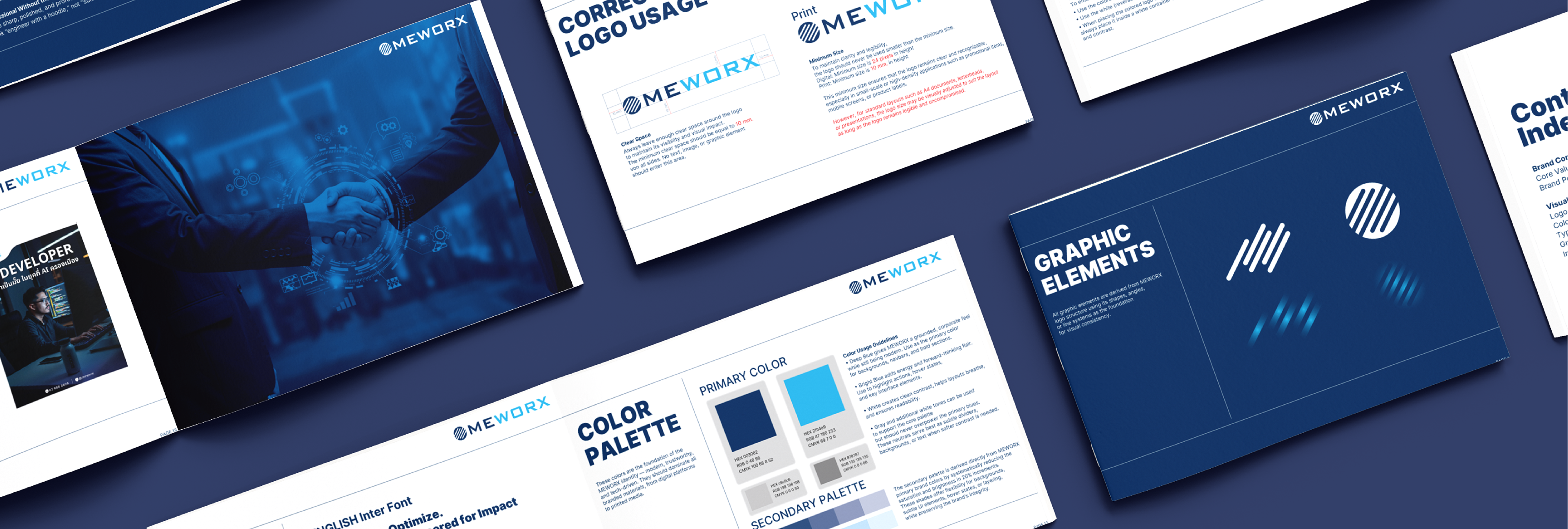
MEWorx Brand Guideline Design A concise, modern brand identity book for MEWorx, covering logo usage, typography, color palettes, and key visual elements. Designed to ensure brand consistency across all digital and print touchpoints.
MEWorx Brand Guideline Design A concise, modern brand identity book for MEWorx, covering logo usage, typography, color palettes, and key visual elements. Designed to ensure brand consistency across all digital and print touchpoints.
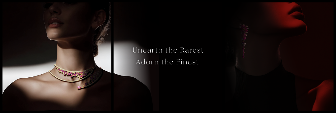
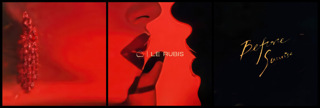
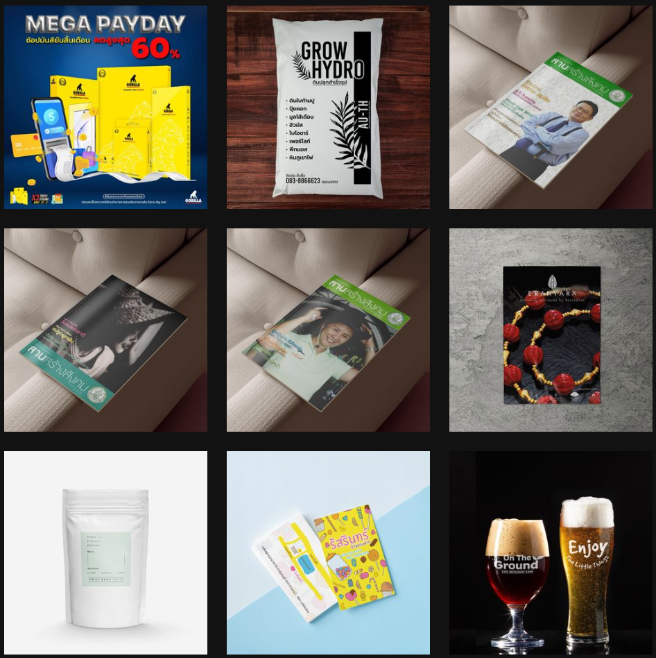
This visual set for Le Rubis explores the deeper shadows of elegance—where light touches only what it dares, and every glint of ruby tells a story of rarity and restraint. Designed for the brand’s Instagram campaign, this darker-toned triptych moves beyond mere adornment and into the realm of quiet power. With sharp contrast and cinematic lighting, the images evoke a timeless sensuality. The composition focuses on fragments of form—necklines, lips, and shadowed skin—allowing the Burmese ruby jewelry to speak volumes in whispers. Unearth the Rarest. Adorn the Finest. This series redefines luxury as an experience not shouted, but felt.
A visual ode to femininity, mystery, and desire—this triptych was crafted for Le Rubis, a fine jewelry brand born from the fiery depths of Burmese rubies. Each image evokes a sensual narrative through abstraction and shadowplay, mirroring the raw allure and emotional intensity of the woman who wears Le Rubis. Designed specifically for the brand’s Instagram presence, the series captures attention through bold contrast, intimate composition, and a cinematic mood. From the molten red textures to the soft silhouette of parted lips, and the final whisper of golden script—Before Sunrise—this set reflects the brand’s signature blend of elegance and intensity.
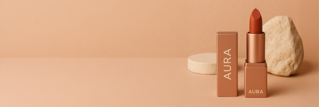
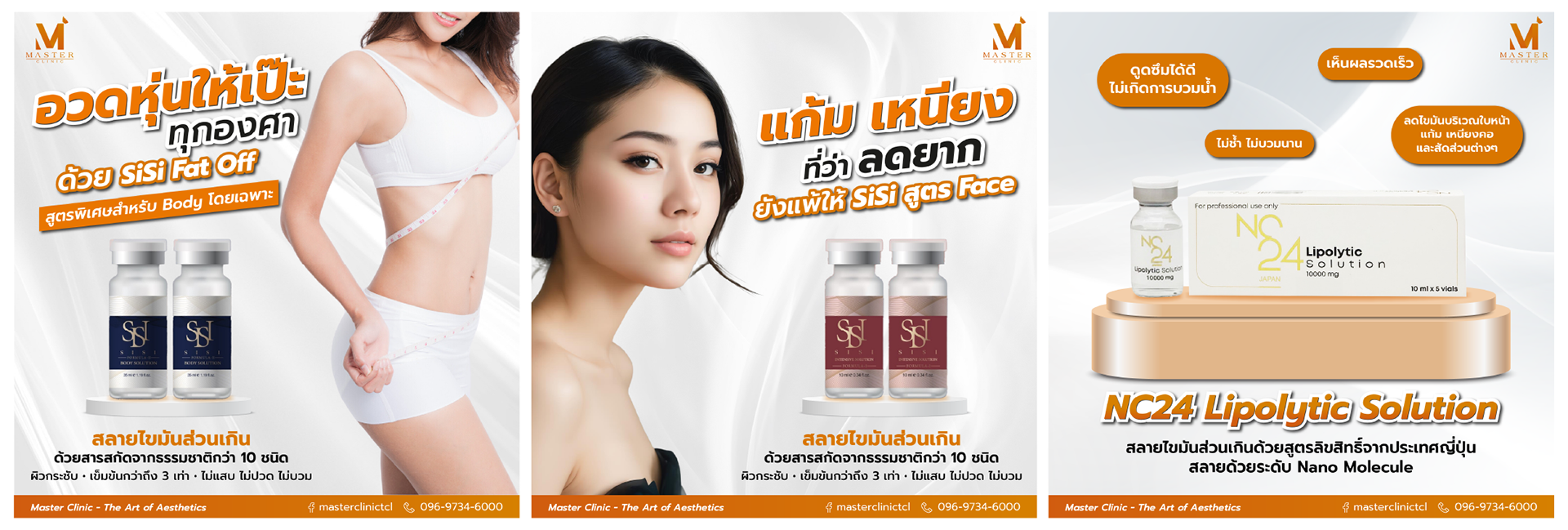
The AURA logo features clean, modern sans-serif typography with balanced spacing that conveys luxury and sophistication. The warm, muted tone creates versatile branding suitable for premium beauty products. The minimalist design ensures strong recognition and readability across all applications. Mood & Tone: The earthy terracotta and nude palette establishes a warm, natural luxury aesthetic. Clean composition with soft shadows and natural stone elements creates a serene, sophisticated atmosphere targeting consumers who value understated elegance and premium quality.
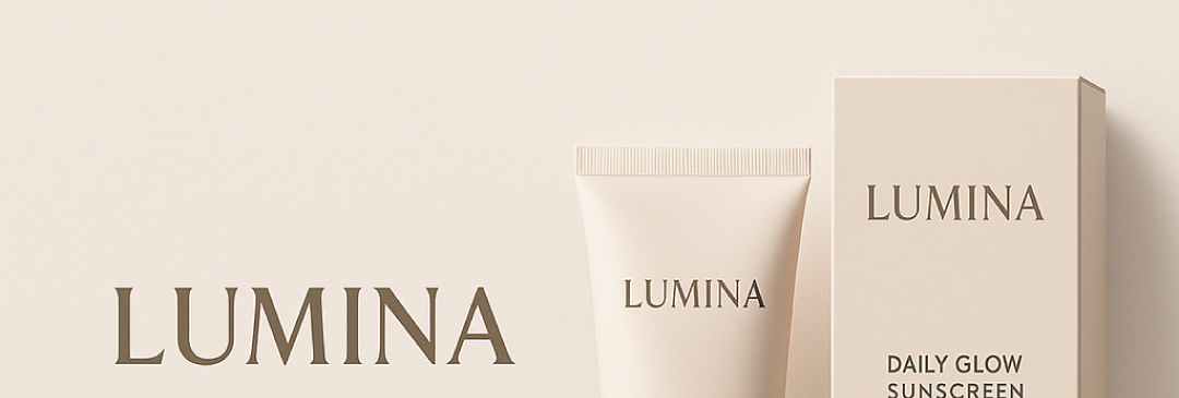
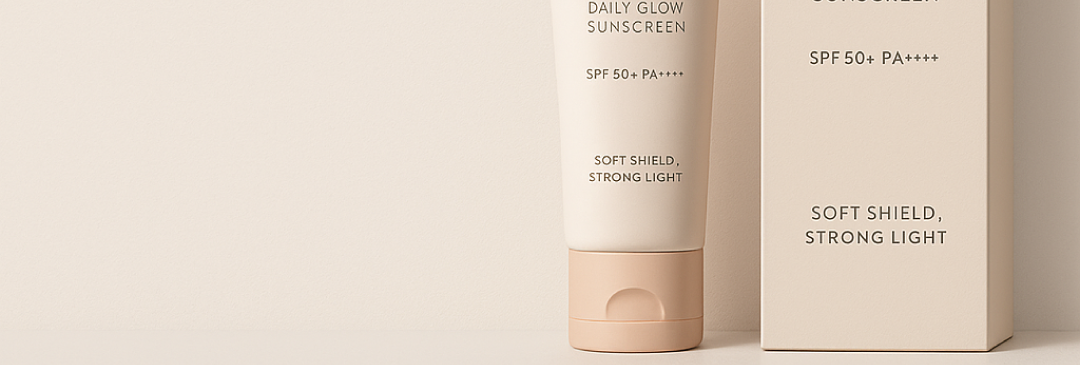
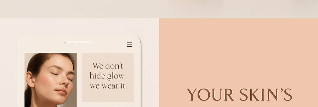
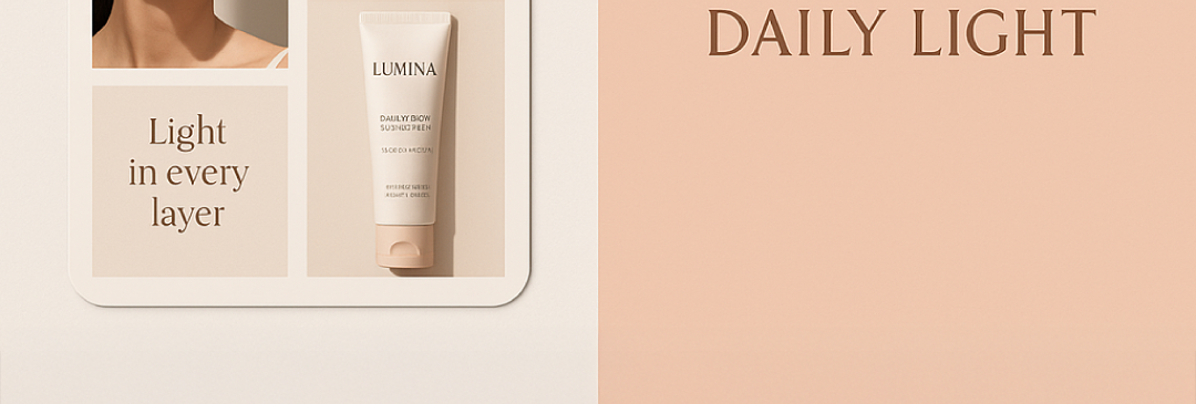
The LUMINA logo employs elegant serif typography that conveys sophistication and timeless beauty. The refined letterforms with subtle contrast create a premium feel suitable for luxury skincare. The warm beige and cream color palette reinforces the brand's focus on natural radiance and healthy glow. Packaging Design: Clean, minimalist packaging design with monochromatic beige tones creates cohesive brand identity. The tube and box feature consistent typography hierarchy with clear product information. The soft, matte finish suggests gentle skincare while maintaining premium positioning.
The LUMINA logo employs elegant serif typography that conveys sophistication and timeless beauty. The refined letterforms with subtle contrast create a premium feel suitable for luxury skincare. The warm beige and cream color palette reinforces the brand's focus on natural radiance and healthy glow. Packaging Design: Clean, minimalist packaging design with monochromatic beige tones creates cohesive brand identity. The tube and box feature consistent typography hierarchy with clear product information. The soft, matte finish suggests gentle skincare while maintaining premium positioning.
The LUMINA logo employs elegant serif typography that conveys sophistication and timeless beauty. The refined letterforms with subtle contrast create a premium feel suitable for luxury skincare. The warm beige and cream color palette reinforces the brand's focus on natural radiance and healthy glow. Packaging Design: Clean, minimalist packaging design with monochromatic beige tones creates cohesive brand identity. The tube and box feature consistent typography hierarchy with clear product information. The soft, matte finish suggests gentle skincare while maintaining premium positioning.
The LUMINA logo employs elegant serif typography that conveys sophistication and timeless beauty. The refined letterforms with subtle contrast create a premium feel suitable for luxury skincare. The warm beige and cream color palette reinforces the brand's focus on natural radiance and healthy glow. Packaging Design: Clean, minimalist packaging design with monochromatic beige tones creates cohesive brand identity. The tube and box feature consistent typography hierarchy with clear product information. The soft, matte finish suggests gentle skincare while maintaining premium positioning.